Cards
Pages are built from cards. Each card has a type and controls what content appears on the page.
Card types
When you Add Card, the type dropdown is grouped to help you find the right one. Available types depend on your plan and what content exists in your mesh:
Basic content
- Hero / Welcome, Header, Text, YouTube Video
- Image, Map (subscriber features)
Single item
Content lists
- Latest Post List, Pinned Posts (when you have posts)
- Upcoming Events (when you have events)
- Page List, Link List, Recent Files
Each card type has its own options. See the subpages below for details on every card.
Adding cards
Open a page and choose Page Content to enter the builder. Use Add Card to create new cards, and select any card in the preview to edit it. A Preview box shows how the card will look as you edit — see Content Builder.
Card styles
Many card types offer several styles — the same content shown in a different layout (a grid, a compact list, a banner, and so on). Pick one from the Style dropdown while editing the card. See Card Styles.
List header and intro
List cards (post lists, events, files, links, and page lists) can show an optional List Header and List Intro above the list. When you set a header, a See all → link is added on the right automatically.
Card list and bulk actions
Below the preview you’ll see a list of cards. Use this list to reorder or delete cards in bulk.
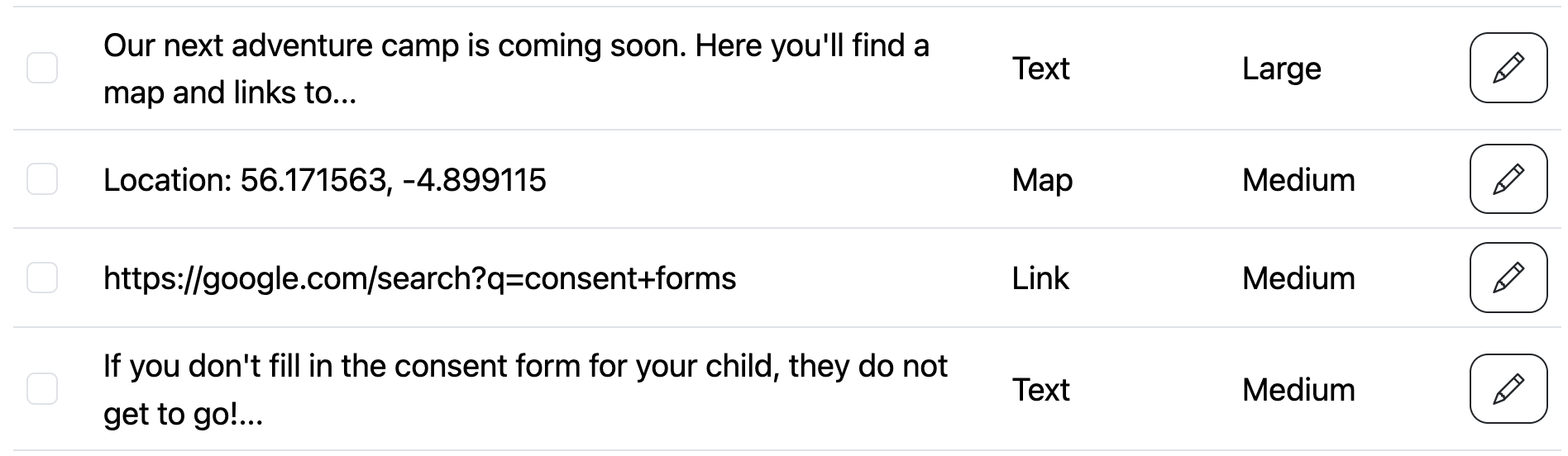
Sections and columns
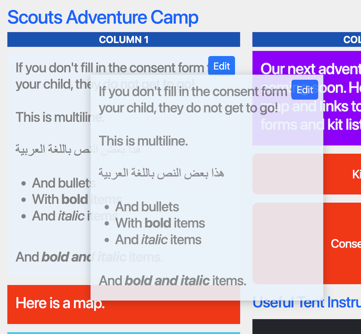
Pages default to two columns, but you can create sections with 1–4 columns. Each card is placed in a section and column. See Sections for details.
You can also drag and drop cards in the preview. See Ordering.
Styling
Many card types support custom colours. These override the page colours just for that card.